Bootstrap学习笔记(三)表单
来源:互联网 发布:关闭电脑软件自动更新 编辑:程序博客网 时间:2024/06/02 14:34
基础表单
表单主要功能是用来与用户做交流的一个网页控件,良好的表单设计能够让网页与用户更好的沟通。表单中常见的元素主要包括:文本输入框、下拉选择框、单选按钮、复选按钮、文本域和按钮等。其中每个控件所起的作用都各不相同,而且不同的浏览器对表单控件渲染的风格都各有不同。
同样,表单也是Bootstrap框架中的核心内容,下面向大家介绍Bootstrap框架中表单的制作。
表单源码查询
Bootstrap框架的表单,其源码占据了大量的代码,同样的,根据不同的Bootstrap版本,你可以轻松获取相应的源码:
☑ LESS版本:对应源文件 forms.less
☑ Sass版本:对应源文件 _forms.scss
编译后的Bootstrap版本,可以查阅bootstrap.css文件第1630行~第1991行
不过在样式表中,还对表单做了一些初始化,详细代码可以查阅bootstrap.css文件第110行~第178行。
对于基础表单,Bootstrap并未对其做太多的定制性效果设计,仅仅对表单内的fieldset、legend、label标签进行了定制。如:
/*源码请查阅bootstrap.css文件第1631行~第1652行*/
fieldset {min-width: 0;padding: 0;margin: 0;border: 0;}legend {display: block;width: 100%;padding: 0;margin-bottom: 20px;font-size: 21px;line-height: inherit;color: #333;border: 0;border-bottom: 1px solid #e5e5e5;}label {display: inline-block;margin-bottom: 5px;font-weight: bold;}主要将这些元素的margin、padding和border等进行了细化设置。
当然表单除了这几个元素之外,还有input、select、textarea等元素,在Bootstrap框架中,通过定制了一个类名`form-control`,也就是说,如果这几个元素使用了类名“form-control”,将会实现一些设计上的定制效果。
1、宽度变成了100%
2、设置了一个浅灰色(#ccc)的边框
3、具有4px的圆角
4、设置阴影效果,并且元素得到焦点之时,阴影和边框效果会有所变化
5、设置了placeholder的颜色为#999
详细请查阅bootstrap.css文件第1690行~第1732行。
运行效果如下或查看右侧结果窗口:
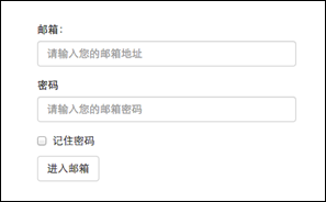
表单代码:
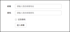
<!doctype html><html lang="en"><head> <meta charset="UTF-8"><title>基础表单</title><link rel="stylesheet" href="//netdna.bootstrapcdn.com/bootstrap/3.1.1/css/bootstrap.min.css"></head><body><form role="form"> <div class="form-group"> <label for="exampleInputEmail1">邮箱:</label> <input type="email" class="form-control" id="exampleInputEmail1" placeholder="请输入您的邮箱地址"> </div> <div class="form-group"> <label for="exampleInputPassword1">密码</label> <input type="password" class="form-control" id="exampleInputPassword1" placeholder="请输入您的邮箱密码"> </div> <div class="checkbox"> <label> <input type="checkbox"> 记住密码 </label> </div> <button type="submit" class="btn btn-default">进入邮箱</button></form></body></html>
水平表单
Bootstrap框架默认的表单是垂直显示风格,但很多时候我们需要的水平表单风格(标签居左,表单控件居右)见下图。
在Bootstrap框架中要实现水平表单效果,必须满足以下两个条件:
1、在<form>元素使用类名“form-horizontal”。
2、配合Bootstrap框架的网格系统。(网格布局会在以后的章节中详细讲解)
在<form>元素上使用类名“form-horizontal”主要有以下几个作用:
1、设置表单控件padding和margin值。
2、改变“form-group”的表现形式,类似于网格系统的“row”。
/*源码请查阅bootstrap.css文件第1963行~第1991行*/
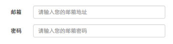
.form-horizontal .control-label,.form-horizontal .radio,.form-horizontal .checkbox,.form-horizontal .radio-inline,.form-horizontal .checkbox-inline {padding-top: 7px;margin-top: 0;margin-bottom: 0;}.form-horizontal .radio,.form-horizontal .checkbox {min-height: 27px;}.form-horizontal .form-group {margin-right: -15px;margin-left: -15px;}.form-horizontal .form-control-static {padding-top: 7px;}@media (min-width: 768px) {.form-horizontal .control-label {text-align: right; }}.form-horizontal .has-feedback .form-control-feedback {top: 0;right: 15px;}来看一个简单的示例:
<form class="form-horizontal" role="form"><div class="form-group"> <label for="inputEmail3" class="col-sm-2 control-label">邮箱</label> <div class="col-sm-10"> <input type="email" class="form-control" id="inputEmail3" placeholder="请输入您的邮箱地址"> </div> </div> <div class="form-group"> <label for="inputPassword3" class="col-sm-2 control-label">密码</label> <div class="col-sm-10"> <input type="password" class="form-control" id="inputPassword3" placeholder="请输入您的邮箱密码"> </div> </div> <div class="form-group"> <div class="col-sm-offset-2 col-sm-10"> <div class="checkbox"> <label> <input type="checkbox">记住密码 </label> </div> </div> </div> <div class="form-group"> <div class="col-sm-offset-2 col-sm-10"> <button type="submit" class="btnbtn-default">进入邮箱</button> </div></div></form>
运行效果如下或查看右侧结果窗口:(注意:要想看到此效果,需要把鼠标移到结果窗口,单击出现的“全屏”按钮)
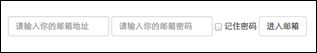
内联表单
有时候我们需要将表单的控件都在一行内显示,类似这样的:

在Bootstrap框架中实现这样的表单效果是轻而易举的,只需要在<form>元素中添加类名“form-inline”即可。
内联表单实现原理非常简单,欲将表单控件在一行显示,就需要将表单控件设置成内联块元素(display:inline-block)。
/*源码请查阅bootstrap.css文件第1928行~第1962行*/
如果你要在input前面添加一个label标签时,会导致input换行显示。如果你必须添加这样的一个label标签,并且不想让input换行,你需要将label标签也放在容器“form-group”中,如:
<div class="form-group"> <label class="sr-only" for="exampleInputEmail2">Email address</label></div><div class="form-group"> <inputtype="email" class="form-control" id="exampleInputEmail2" placeholder="Enter email"></div>
接下来,我们还是以实例说话:
<form class="form-inline" role="form"><div class="form-group"> <label class="sr-only" for="exampleInputEmail2">邮箱</label> <input type="email" class="form-control" id="exampleInputEmail2" placeholder="请输入你的邮箱地址"></div><div class="form-group"> <label class="sr-only" for="exampleInputPassword2">密码</label> <input type="password" class="form-control" id="exampleInputPassword2" placeholder="请输入你的邮箱密码"></div><div class="checkbox"><label> <input type="checkbox">记住密码</label></div><button type="submit" class="btnbtn-default">进入邮箱</button></form>
运行效果如下或查看右侧结果窗口:(查看效果需要把结果窗口设置为全屏)
回过头来看示例,你或许会问,为什么添加了label标签,而且没有放置在”form-group”这样的容器中,input也不会换行;还有label标签怎么没显示出来。如果你仔细看,在label标签运用了一个类名“sr-only”,标签没显示就是这个样式将标签隐藏了。
/*源码请查阅bootstrap.css文件第342行~第350行*/
.sr-only {position: absolute;width: 1px;height: 1px;padding: 0;margin: -1px;overflow: hidden;clip: rect(0, 0, 0, 0);border: 0;}注意:那么Bootstrap为什么要这么做呢?这样不是多此一举吗?其实不是的,如果没有为输入控件设置label标签,屏幕阅读器将无法正确识别。这也是Bootstrap框架另一个优点之处,为残障人员进行了一定的考虑。
表单控件(输入框input)
每一个表单都是由表单控件组成。离开了控件,表单就失去了意义。接下来的我们简单的来了解Bootstrap框架中表单控件的相关知识。
单行输入框,常见的文本输入框,也就是input的type属性值为text。在Bootstrap中使用input时也必须添加type类型,如果没有指定type类型,将无法得到正确的样式,因为Bootstrap框架都是通过input[type=“?”](其中?号代表type类型,比如说text类型,对应的是input[type=“text”])的形式来定义样式的。
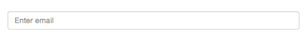
为了让控件在各种表单风格中样式不出错,需要添加类名“form-control”,如:
<form role="form"><div class="form-group"><input type="email" class="form-control" placeholder="Enter email"></div></form>
运行效果如下或查看右侧结果窗口:
表单控件(下拉选择框select)
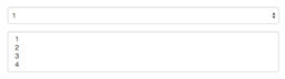
Bootstrap框架中的下拉选择框使用和原始的一致,多行选择设置multiple属性的值为multiple。Bootstrap框架会为这些元素提供统一的样式风格。如:
<form role="form"><div class="form-group"> <select class="form-control"> <option>1</option> <option>2</option> <option>3</option> <option>4</option> <option>5</option> </select> </div> <div class="form-group"> <select multiple class="form-control"> <option>1</option> <option>2</option> <option>3</option> <option>4</option> <option>5</option> </select></div></form>
运行效果如下或查看右侧结果窗口:
表单控件(文本域textarea)
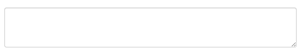
文本域和原始使用方法一样,设置rows可定义其高度,设置cols可以设置其宽度。但如果textarea元素中添加了类名“form-control”类名,则无需设置cols属性。因为Bootstrap框架中的“form-control”样式的表单控件宽度为100%或auto。
<form role="form"> <div class="form-group"> <textarea class="form-control" rows="3"></textarea> </div></form>运行效果如下或查看右侧结果窗口:
表单控件(复选框checkbox和单选择按钮radio)
Bootstrap框架中checkbox和radio有点特殊,Bootstrap针对他们做了一些特殊化处理,主要是checkbox和radio与label标签配合使用会出现一些小问题(最头痛的是对齐问题)。使用Bootstrap框架,开发人员无需考虑太多,只需要按照下面的方法使用即可。
<form role="form"><div class="checkbox"><label><input type="checkbox" value="">记住密码</label></div><div class="radio"><label><input type="radio" name="optionsRadios" id="optionsRadios1" value="love" checked>喜欢</label></div><div class="radio"><label><input type="radio" name="optionsRadios" id="optionsRadios2" value="hate">不喜欢</label></div></form>
运行效果如下或查看右侧结果窗口(案例1):
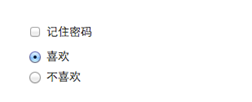
从上面的示例,我们可以得知:
1、不管是checkbox还是radio都使用label包起来了
2、checkbox连同label标签放置在一个名为“.checkbox”的容器内
3、radio连同label标签放置在一个名为“.radio”的容器内
在Bootstrap框架中,主要借助“.checkbox”和“.radio”样式,来处理复选框、单选按钮与标签的对齐方式。源码请查看bootstrap.css文件第1742行~第1762行:
.radio,.checkbox {display: block;min-height: 20px;padding-left: 20px;margin-top: 10px;margin-bottom: 10px;}.radio label,.checkbox label {display: inline;font-weight: normal;cursor: pointer;}.radio input[type="radio"],.radio-inline input[type="radio"],.checkbox input[type="checkbox"],.checkbox-inline input[type="checkbox"] {float: left;margin-left: -20px;}.radio + .radio,.checkbox + .checkbox {margin-top: -5px;}表单控件(复选框和单选按钮水平排列)
有时候,为了布局的需要,将复选框和单选按钮需要水平排列。Bootstrap框架也做了这方面的考虑:
1、如果checkbox需要水平排列,只需要在label标签上添加类名“checkbox-inline”
2、如果radio需要水平排列,只需要在label标签上添加类名“radio-inline”
如下所示:
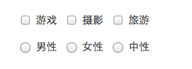
<form role="form"> <div class="form-group"> <label class="checkbox-inline"> <input type="checkbox" value="option1">游戏 </label> <label class="checkbox-inline"> <input type="checkbox" value="option2">摄影 </label> <label class="checkbox-inline"> <input type="checkbox" value="option3">旅游 </label> </div> <div class="form-group"> <label class="radio-inline"> <input type="radio" value="option1" name="sex">男性 </label> <label class="radio-inline"> <input type="radio" value="option2" name="sex">女性 </label> <label class="radio-inline"> <input type="radio" value="option3" name="sex">中性 </label> </div></form>
运行效果如下或查看右侧结果窗口:
实现源码请查看bootstrap.css文件第1767行~第1780行:
.radio-inline,.checkbox-inline {display: inline-block;padding-left: 20px;margin-bottom: 0;font-weight: normal;vertical-align: middle;cursor: pointer;}.radio-inline + .radio-inline,.checkbox-inline + .checkbox-inline {margin-top: 0;margin-left: 10px;}表单控件(按钮)
按钮也是表单重要控件之一,制作按钮通常使用下面代码来实现:
☑ input[type=“submit”]
☑ input[type=“button”]
☑ input[type=“reset”]
☑ <button>
在Bootstrap框架中的按钮都是采用<button>来实现。
有关于Bootstrap中按钮如何制作,在这里不做过多阐述,因为按钮也是Bootstrap框架中核心部分之一,后面我们专门有一节内容来介绍Bootstrap的按钮。
这里先让大家看看Bootstrap的按钮长成什么样:
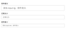
表单控件大小
前面看到的表单控件都正常的大小。可以通过设置控件的height,line-height,padding和font-size等属性来实现控件的高度设置。不过Bootstrap框架还提供了两个不同的类名,用来控制表单控件的高度。这两个类名是:
1、input-sm:让控件比正常大小更小
2、input-lg:让控件比正常大小更大
这两个类适用于表单中的input,textarea和select控件,具体使用如下:
<input class="form-control input-lg" type="text" placeholder="添加.input-lg,控件变大"><input class="form-control" type="text" placeholder="正常大小"><input class="form-control input-sm" type="text" placeholder="添加.input-sm,控件变小">
运行效果如下或查看右侧结果窗口:
源码请查阅bootstrap.css文件第1795~第1824行:
.input-sm {height: 30px;padding: 5px 10px;font-size: 12px;line-height: 1.5;border-radius: 3px;}select.input-sm {height: 30px;line-height: 30px;}textarea.input-sm,select[multiple].input-sm {height: auto;}.input-lg {height: 46px;padding: 10px 16px;font-size: 18px;line-height: 1.33;border-radius: 6px;}select.input-lg {height: 46px;line-height: 46px;}textarea.input-lg,select[multiple].input-lg {height: auto;}
从上面的源码中不难发现,不管是“input-sm”还是“input-lg”仅对控件高度做了处理。但往往很多时候,我们需要控件宽度也要做一定的变化处理。这个时候就要借住Bootstrap框架的网格系统。所以你要控制表单宽度,可以像下面这样使用:
<form role="form" class="form-horizontal"> <div class="form-group"> <div class="col-xs-4"> <input class="form-control input-lg" type="text" placeholder=".col-xs-4"> </div> <div class="col-xs-4"> <input class="form-control input-lg" type="text" placeholder=".col-xs-4"> </div> <div class="col-xs-4"> <input class="form-control input-lg" type="text" placeholder=".col-xs-4"> </div> </div> …</form>
注:网格布局在后面章节中会进行详细讲解。
运行效果如下或查看右侧结果窗口:
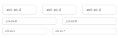
前面介绍水平表单时说过,如果表单使用了类名“form-horizontal”,其中“form-group”就相当于网格系统中的“row”。换句话说,如果没有这样做,要通过网格系统来控制表单控件宽度,就需要这样使用:
<div class="row"><div class="col-xs-4"><input class="form-control input-lg" type="text" placeholder=".col-xs-4"></div><div class="col-xs-4"><input class="form-control input-lg" type="text" placeholder=".col-xs-4"></div><div class="col-xs-4"><input class="form-control input-lg" type="text" placeholder=".col-xs-4"></div></div>
表单控件状态(焦点状态)
表单主要用来与用户沟通,好的表单就能更好的与用户进行沟通,而好的表单一定离不开表单的控件状态。
表单状态的作用:
每一种状态都能给用户传递不同的信息,比如表单有焦点的状态可以告诉用户可以输入或选择东西,禁用状态可以告诉用户不可以输入或选择东西,还有就是表单控件验证状态,可以告诉用户的操作是否正确等。那么在Bootstrap框架中的表单控件也具备这些状态。
焦点状态是通过伪类“:focus”来实现。Bootstrap框架中表单控件的焦点状态删除了outline的默认样式,重新添加阴影效果。
源码请查阅bootstrap.css文件第1707行~第1712行:
.form-control:focus {border-color: #66afe9;outline: 0; -webkit-box-shadow: inset 0 1px 1pxrgba(0,0,0,.075), 0 0 8px rgba(102, 175, 233, .6);box-shadow: inset 0 1px 1pxrgba(0,0,0,.075), 0 0 8px rgba(102, 175, 233, .6);}从源码中我们可以看出,要让控件在焦点状态下有上面样式效果,需要给控件添加类名“form-control”:
<form role="form" class="form-horizontal"> <div class="form-group"> <div class="col-xs-6"> <input class="form-control input-lg" type="text" placeholder="不是焦点状态下效果"> </div> <div class="col-xs-6"> <input class="form-control input-lg" type="text" placeholder="焦点点状态下效果"> </div> </div></form>
运行效果如下或查看右侧结果窗口:
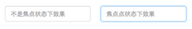
(鼠标单击输入框,使其获得焦点就可以看到加入蓝色边框效果)
在Bootstrap框架中,file、radio和checkbox控件在焦点状态下的效果也与普通的input控件不太一样,主要是因为Bootstrap对他们做了一些特殊处理:
/*源码查看boostrap.css文件第1676行~第1682行*/
input[type="file"]:focus,input[type="radio"]:focus,input[type="checkbox"]:focus {outline: thin dotted;outline: 5px auto -webkit-focus-ring-color;outline-offset: -2px;}
表单控件状态(禁用状态)
Bootstrap框架的表单控件的禁用状态和普通的表单禁用状态实现方法是一样的,在相应的表单控件上添加属性“disabled”。和其他表单的禁用状态不同的是,Bootstrap框架做了一些样式风格的处理:
/*源码请查看bootstrap.css文件第1723行~第1729行*/
.form-control[disabled],.form-control[readonly],fieldset[disabled] .form-control {cursor: not-allowed;background-color: #eee;opacity: 1;}使用方法为:只需要在需要禁用的表单控件上加上“disabled”即可:
<input class="form-control" type="text" placeholder="表单已禁用,不能输入" disabled>运行效果如下或查看右侧结果窗口:
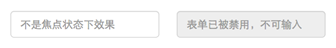
在使用了“form-control”的表单控件中,样式设置了禁用表单背景色为灰色,而且手型变成了不准输入的形状。如果控件中不使用类名“form-control”,禁用的控件只会有一个不准输入的手型出来。
/*源码请查阅bootstrap.css文件第1781行~第1794行*/
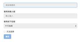
input[type="radio"][disabled],input[type="checkbox"][disabled],.radio[disabled],.radio-inline[disabled],.checkbox[disabled],.checkbox-inline[disabled],fieldset[disabled] input[type="radio"],fieldset[disabled] input[type="checkbox"],fieldset[disabled] .radio,fieldset[disabled] .radio-inline,fieldset[disabled] .checkbox,fieldset[disabled] .checkbox-inline {cursor: not-allowed;}在Bootstrap框架中,如果fieldset设置了disabled属性,整个域都将处于被禁用状态。
<form role="form"><fieldset disabled> <div class="form-group"> <label for="disabledTextInput">禁用的输入框</label> <input type="text" id="disabledTextInput" class="form-control" placeholder="禁止输入"> </div> <div class="form-group"> <label for="disabledSelect">禁用的下拉框</label> <select id="disabledSelect" class="form-control"> <option>不可选择</option> </select> </div> <div class="checkbox"> <label> <input type="checkbox">无法选择 </label> </div> <button type="submit" class="btnbtn-primary">提交</button></fieldset></form>运行效果如下或查看右侧结果窗口:

据说对于整个禁用的域中,如果legend中有输入框的话,这个输入框是无法被禁用的。我们一起来验证一下:
<form role="form"><fieldset disabled><legend><input type="text" class="form-control" placeholder="显然我颜色变灰了,但是我没被禁用,不信?单击试一下" /></legend> …</fieldset></form>
运行效果如下或查看右侧结果窗口:
表单控件状态(验证状态)
在制作表单时,不免要做表单验证。同样也需要提供验证状态样式,在Bootstrap框架中同样提供这几种效果。
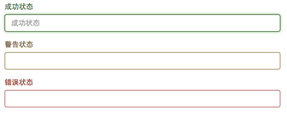
1、.has-warning:警告状态(黄色)
2、.has-error:错误状态(红色)
3、.has-success:成功状态(绿色)
使用的时候只需要在form-group容器上对应添加状态类名。
<form role="form"><div class="form-group has-success"> <label class="control-label" for="inputSuccess1">成功状态</label> <input type="text" class="form-control" id="inputSuccess1" placeholder="成功状态" ></div><div class="form-group has-warning"> <label class="control-label" for="inputWarning1">警告状态</label> <input type="text" class="form-control" id="inputWarning1" placeholder="警告状态"></div><div class="form-group has-error"> <label class="control-label" for="inputError1">错误状态</label> <input type="text" class="form-control" id="inputError1" placeholder="错误状态"></div></form>
运行效果如下或查看右侧结果窗口:
从效果可以看出,三种状态下效果都是一样的,只是颜色不一样而以。
其他两种状态省略源码不在此展示。
很多时候,在表单验证的时候,不同的状态会提供不同的 icon,比如成功是一个对号(√),错误是一个叉号(×)等。在Bootstrap框中也提供了这样的效果。如果你想让表单在对应的状态下显示 icon 出来,只需要在对应的状态下添加类名“has-feedback”。请注意,此类名要与“has-error”、“has-warning”和“has-success”在一起:
<form role="form"><div class="form-group has-success has-feedback"> <label class="control-label" for="inputSuccess1">成功状态</label> <input type="text" class="form-control" id="inputSuccess1" placeholder="成功状态" > <span class="glyphiconglyphicon-ok form-control-feedback"></span></div><div class="form-group has-warning has-feedback"> ......</div><div class="form-group has-error has-feedback"> ......</div></form>
运行效果如下或查看右侧结果窗口:
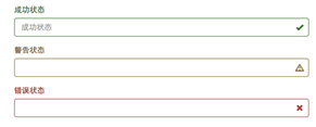
从效果图中可以看出,图标都居右。在 Bootstrap 的小图标都是使用@font-face来制作(后面的内容中将会着重用一节内容来介绍)。而且必须在表单中添加了一个 span 元素:
<span class="glyphiconglyphicon-warning-sign form-control-feedback"></span><div class="form-group has-error has-feedback"> <label class="control-label" for="inputError1">email地址</label> <input type="text" class="form-control" id="inputError1"> <span class="glyphicon glyphicon-remove form-control-feedback"></span> </div>
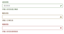
表单提示信息
平常在制作表单验证时,要提供不同的提示信息。在Bootstrap框架中也提供了这样的效果。使用了一个"help-block"样式,将提示信息以块状显示,并且显示在控件底部。
<form role="form"><div class="form-group has-success has-feedback"> <label class="control-label" for="inputSuccess1">成功状态</label> <input type="text" class="form-control" id="inputSuccess1" placeholder="成功状态" > <span class="help-block">你输入的信息是正确的</span> <span class="glyphiconglyphicon-ok form-control-feedback"></span></div> …</form>运行效果如下或查看右侧结果窗口:
具体样式代码请查看bootstrap.css文件第1922行~第1927行:
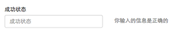
.help-block {display: block;margin-top: 5px;margin-bottom: 10px;color: #737373;}在Bootstrap V2.x版本中还提供了一个行内提示信息,其使用了类名“help-inline”。一般让提示信息显示在控件的后面,也就是同一水平显示。如果你想在BootstrapV3.x版本也有这样的效果,你可以添加这段代码:
.help-inline{ display:inline-block; padding-left:5px; color: #737373;}如果你不想为bootstrap.css增加自己的代码,而且设计又有这种样的需求,那么只能借助于Bootstrap的网格系统。(网格系统在后面的章节中会详细讲解)
<form role="form"><div class="form-group"><label class="control-label" for="inputSuccess1">成功状态</label><div class="row"><div class="col-xs-6"><input type="text" class="form-control" id="inputSuccess1" placeholder="成功状态" ></div><span class="col-xs-6 help-block">你输入的信息是正确的</span></div></div></form>运行效果如下或查看右侧结果窗口:
结束语:有关于Bootstrap框架中表单的运用除了按钮部分,到此就算是介绍完了。如果你觉得这样的表单效果并不是你需要的,你完全可以通过forms.less或者_forms.scss文件进行定制,然后重新编译就可以得到你需要的表单效果。
按钮
按钮也是Bootstrap框架核心内容之一。因为按钮是Web制作中不可缺少的东西。而且不同的Web页面具有不同的按钮风格,甚至说同一个Web网站或应用程序具有多种按钮风格,比如说不同的按钮颜色、大小和状态等。那么Bootstrap框架也考虑了这些因素,接下来的内容我们一起来探讨Bootstrap框架中的另一核心部分内容——按钮。
Bootstrap框架的按钮也是一个独立部分,我们同样在不同的版本之中能找到对应的代码:
- LESS版本:查看源文件buttons.less
- Sass版本:查看源文件_buttons.scss
- 已编译版本:查看源文件bootstrap.css文件第1992行~第2353行
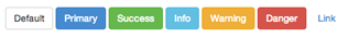
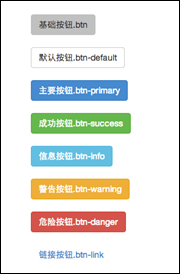
<button class="btn" type="button">基础按钮.btn</button> <button class="btn btn-default" type="button">默认按钮.btn-default</button> <button class="btn btn-primary" type="button">主要按钮.btn-primary</button> <button class="btn btn-success" type="button">成功按钮.btn-success</button> <button class="btn btn-info" type="button">信息按钮.btn-info</button> <button class="btn btn-warning" type="button">警告按钮.btn-warning</button> <button class="btn btn-danger" type="button">危险按钮.btn-danger</button> <button class="btn btn-link" type="button">链接按钮.btn-link</button>
基本按钮
Bootstrap框架V3.x版本的基本按钮和V2.x版本的基本按钮一样,都是通过类名“btn”来实现。不同的是在V3.x版本要简约很多,去除了V2.x版本中的大量的CSS3中的部分特效,比如说文本阴影(text-shadow)、渐变背景(background-image)、边框阴影(box-shadow)等。
难能可贵的是,Bootstrap框架中的考虑了不同浏览器的解析差异,进行了比较安全的兼容性处理,使按钮效果在不同的浏览器中所呈现的效果基本相同。
源码请查阅bootstrap.css文件第1992行~第2010行:
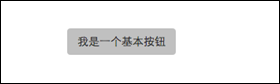
.btn {display: inline-block;padding: 6px 12px;margin-bottom: 0;font-size: 14px;font-weight: normal;line-height: 1.42857143;text-align: center;white-space: nowrap;vertical-align: middle;cursor: pointer; -webkit-user-select: none; -moz-user-select: none; -ms-user-select: none;user-select: none;background-image: none;border: 1px solid transparent;border-radius: 4px;}Bootstrap框架的按钮使用非常的简单,使用方式如下:
<button class="btn" type="button">我是一个基本按钮</button>运行效果如下或查看右侧结果窗口:
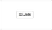
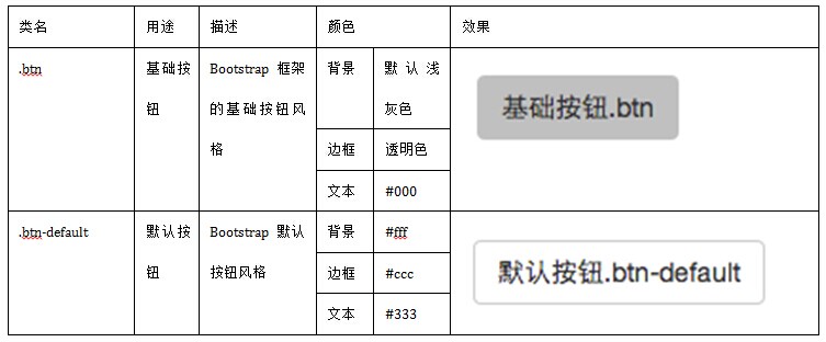
默认按钮
Bootstrap框架首先通过基础类名“.btn”定义了一个基础的按钮风格,然后通过“.btn-default”定义了一个默认的按钮风格。默认按钮的风格就是在基础按钮的风格的基础上修改了按钮的背景颜色、边框颜色和文本颜色。
/*源码请查阅bootstrap.css文件第2040行~第2044行*/
.btn-default {color: #333;background-color: #fff;border-color: #ccc;}使用默认按钮风格也非常的简单,只需要在基础按钮“btn”的基础上增加类名“btn-default”即可:
<button class="btn btn-default" type="button">默认按钮</button>运行效果如下或查看右侧结果窗口:
多标签支持
一般制作按钮除了使用<button>标签元素之外,还可以使用<input type="submit">和<a>标签等。同样,在Bootstrap框架中制作按钮时,除了刚才所说的这些标签元素之外,还可以使用在其他的标签元素上,唯一需要注意的是,要在制作按钮的标签元素上添加类名“btn”。如果不添加是不会有任何按钮效果。
我们一起来看看其他标签制作的基本按钮效果:
<button class="btn btn-default" type="button">button标签按钮</button><input type="submit" class="btn btn-default" value="input标签按钮"/><a href="##" class="btn btn-default">a标签按钮</a><span class="btn btn-default">span标签按钮</span><div class="btn btn-default">div标签按钮</div>
运行效果如下或查看右侧结果窗口:
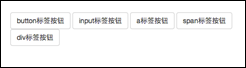
注意:虽然在Bootstrap框架中使用任何标签元素都可以实现按钮风格,但个人并不建议这样使用,为了避免浏览器兼容性问题,个人强烈建议使用button或a标签来制作按钮。
定制风格
在介绍按钮开篇就说过,Web页面可能会有不同的按钮风格。那么在Bootstrap框架也考虑了。在Bootstrap框架中除了默认的按钮风格之外,还有其他六种按钮风格,每种风格的其实都一样,不同之处就是按钮的背景颜色、边框颜色和文本颜色。
在Bootstrap框架中不同的按钮风格都是通过不同的类名来实现,在使用过程中,开发者只需要选择不同的类名即可:
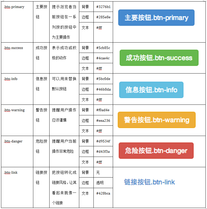
使用起来就很简单,就像前面介绍的默认按钮一样的使用方法,只需要在基础按钮“.btn”基础上追加对应的类名,就可以得到需要的按钮风格。如:
<button class="btn" type="button">基础按钮.btn</button><button class="btn btn-default" type="button">默认按钮.btn-default</button><button class="btn btn-primary" type="button">主要按钮.btn-primary</button><button class="btn btn-success" type="button">成功按钮.btn-success</button><button class="btn btn-info" type="button">信息按钮.btn-info</button><button class="btn btn-warning" type="button">警告按钮.btn-warning</button><button class="btn btn-danger" type="button">危险按钮.btn-danger</button><button class="btn btn-link" type="button">链接按钮.btn-link</button>
运行效果如下或查看右侧结果窗口:
有关于按钮风格定制的源码可以查阅bootstrap.css文件第2081行~第2318行。
按钮大小
上一节介绍了按钮的定制风格,也就是如何实现Web页面中多种风格按钮。在Bootstrap框架中,对于按钮的大小,也是可以定制的。类似于input一样,通过在基础按钮“.btn”的基础上追加类名来控制按钮的大小。
在Bootstrap框架中提供了三个类名来控制按钮大小:
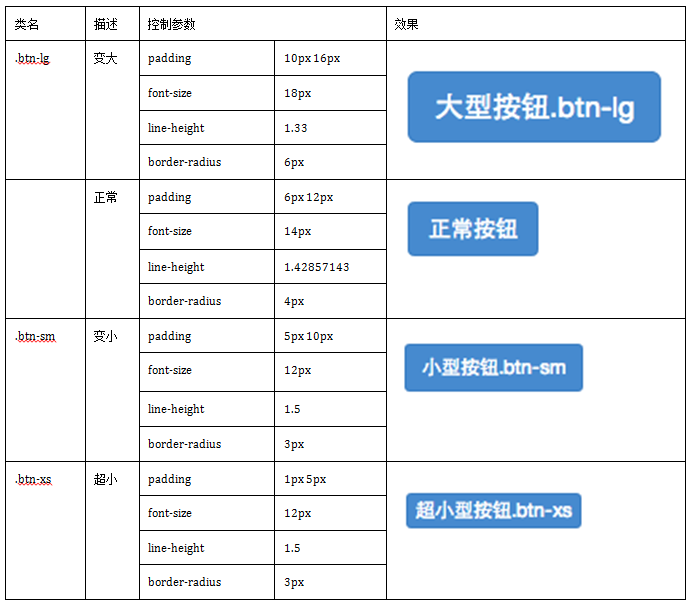
从上表中不难发现,在Bootstrap框架中控制按钮的大小都是通过修改按钮的padding、line-height、font-size和border-radius几个属性。
/*源码查阅bootstrap.css文件中第2319行~第2339行*/
.btn-lg,.btn-group-lg> .btn {padding: 10px 16px;font-size: 18px;line-height: 1.33;border-radius: 6px;}.btn-sm,.btn-group-sm> .btn {padding: 5px 10px;font-size: 12px;line-height: 1.5;border-radius: 3px;}.btn-xs,.btn-group-xs> .btn {padding: 1px 5px;font-size: 12px;line-height: 1.5;border-radius: 3px;}那么在实际使用中,这几个类名可以配合按钮中其他颜色类名一起使用,但唯一一点不能缺少“.btn”类名:
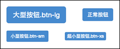
<button class="btn btn-primary btn-lg" type="button">大型按钮.btn-lg</button><button class="btn btn-primary" type="button">正常按钮</button><button class="btn btn-primary btn-sm" type="button">小型按钮.btn-sm</button><button class="btn btn-primary btn-xs" type="button">超小型按钮.btn-xs</button>
效果如下图或查看右侧结果窗口:
块状按钮
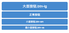
从前面几节的内容中,大家可能发现了,每个示例中的按钮宽度都是依靠按钮文本和padding的值来决定。但有时候在制作按钮的时候需要按钮宽度充满整个父容器(width:100%),特别是在移动端的制作中。那么前面的方法我们都无法很好的实现,除非重新定义按钮的宽度。其实在Bootstrap中并不需要这样做,Bootstrap框架中提供了一个类名“btn-block”。按钮使用这个类名就可以让按钮充满整个容器,并且这个按钮不会有任何的padding和margin值。在实际当中,常把这种按钮称为块状按钮。具体源码请查阅bootstrap.css文件第2340行~第2353行:
.btn-block {display: block;width: 100%;padding-right: 0;padding-left: 0;}.btn-block + .btn-block {margin-top: 5px;}input[type="submit"].btn-block,input[type="reset"].btn-block,input[type="button"].btn-block {width: 100%;}使用方法和前面的类似,只需要在原按钮类名上添加“.btn-block”类名,当然“.btn”类名是不可或缺的:
<button class="btnbtn-primary btn-lg btn-block" type="button">大型按钮.btn-lg</button><button class="btnbtn-primary btn-block" type="button">正常按钮</button><button class="btnbtn-primary btn-sm btn-block" type="button">小型按钮.btn-sm</button><button class="btnbtn-primary btn-xs btn-block" type="button">超小型按钮.btn-xs</button>
运行效果如下:
按钮状态——活动状态
Bootstrap框架针对按钮的状态做了一些特殊处理。在Bootstrap框架中针对按钮的状态效果主要分为两种:活动状态和禁用状态。
Bootstrap按钮的活动状态主要包括按钮的悬浮状态(:hover),点击状态(:active)和焦点状态(:focus)几种。
/*源码请查看bootstrap.css文件第2011行~第2029行*/
.btn:focus,.btn:active:focus,.btn.active:focus {outline: thin dotted;outline: 5px auto -webkit-focus-ring-color;outline-offset: -2px;}.btn:hover,.btn:focus {color: #333;text-decoration: none;}.btn:active,.btn.active {background-image: none;outline: 0; -webkit-box-shadow: inset 0 3px 5px rgba(0, 0, 0, .125);box-shadow: inset 0 3px 5px rgba(0, 0, 0, .125);}而且不同风格下的按钮都具有这几种状态效果,只是颜色做了一定的调整,我们以默认风格(btn-default)为例:
/*源码请查看bootstrap.css文件第2045行~第2058行*/
.btn-default:hover,.btn-default:focus,.btn-default:active,.btn-default.active,.open .dropdown-toggle.btn-default {color: #333;background-color: #ebebeb;border-color: #adadad;}.btn-default:active,.btn-default.active,.open .dropdown-toggle.btn-default {background-image: none;}当按钮处理正在点击状态(也就是鼠标按下的未松开的状态),对于<button>元素是通过“:active”伪类实现,而对于<a>这样的标签元素则是通过添加类名“.active”来实现。
按钮状态——禁用状态
和input等表单控件一样,在Bootstrap框架的按钮中也具有禁用状态的设置。禁用状态与其他状态按钮相比,就是背景颜色的透明度做了一定的处理,opcity的值从100%调整为65%。
在Bootstrap框架中,要禁用按钮有两种实现方式:
方法1:在标签中添加disabled属性
方法2:在元素标签中添加类名“disabled”
两者的主要区别是:
“.disabled”样式不会禁止按钮的默认行为,比如说提交和重置行为等。如果想要让这样的禁用按钮也能禁止按钮的默认行为,则需要通过JavaScript这样的语言来处理。对于<a>标签也存在类似问题,如果通过类名“.disable”来禁用按钮,其链接行为是无法禁止。而在元素标签中添加“disabled”属性的方法是可以禁止元素的默认行为的。
下面是两种方法的举例:
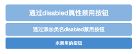
<button class="btnbtn-primary btn-lgbtn-block" type="button" disabled="disabled">通过disabled属性禁用按钮</button><button class="btnbtn-primary btn-block disabled" type="button">通过添加类名disabled禁用按钮</button><button class="btnbtn-primary btn-smbtn-block" type="button">未禁用的按钮</button>
运行效果如下或查看右侧结果窗口:
对应的样式代码请查阅bootstrap.css文件第2030行~第2039行:
.btn.disabled,.btn[disabled],fieldset[disabled] .btn {pointer-events: none;cursor: not-allowed;filter: alpha(opacity=65); -webkit-box-shadow: none;box-shadow: none;opacity: .65;}同样的,其他风格按钮也具有这样的效果,只是颜色做了一定的调整,比如信息按钮(.btn-info)所示:
/*源码请查看bootstrap.css文件第2182行~第2199行*/
.btn-info.disabled,.btn-info[disabled],fieldset[disabled] .btn-info,.btn-info.disabled:hover,.btn-info[disabled]:hover,fieldset[disabled] .btn-info:hover,.btn-info.disabled:focus,.btn-info[disabled]:focus,fieldset[disabled] .btn-info:focus,.btn-info.disabled:active,.btn-info[disabled]:active,fieldset[disabled] .btn-info:active,.btn-info.disabled.active,.btn-info[disabled].active,fieldset[disabled] .btn-info.active {background-color: #5bc0de;border-color: #46b8da;}到此有关于按钮的基础知识就算是介绍完了,同样的,大家可以通过buttons.less或者_buttons.scss来自定义按钮风格。
为reset按钮添加“.disabled”样式的方法使reset按钮处于禁止状态
<form action="index.html" method="get"> <input type="text" name="name">名字 <button type="reset" class="btn btn-primary " disabled="disabled">重置</button> </form>
图像
图像在网页制作中也是常要用到的元素,在Bootstrap框架中对于图像的样式风格提供以下几种风格:
1、img-responsive:响应式图片,主要针对于响应式设计
2、img-rounded:圆角图片
3、img-circle:圆形图片
4、img-thumbnail:缩略图片
使用方法:
使用方法非常简单,只需要在<img>标签上添加对应的类名,如下代码:
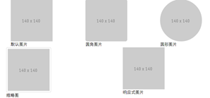
<img alt="140x140" src="http://placehold.it/140x140"><img class="img-rounded" alt="140x140" src="http://placehold.it/140x140"><img class="img-circle" alt="140x140" src="http://placehold.it/140x140"><img class="img-thumbnail" alt="140x140" src="http://placehold.it/140x140"><img class="img-responsive" alt="140x140" src="http://placehold.it/140x140">
运行效果如下或查看右侧结果窗口:
每种状态对应的源码可以查阅bootstrap.css文件第306行~第335行:
img {vertical-align: middle;}.img-responsive,.thumbnail>img,.thumbnail a >img,.carousel-inner > .item >img,.carousel-inner > .item > a >img {display: block;max-width: 100%;height: auto;}.img-rounded {border-radius: 6px;}.img-thumbnail {display: inline-block;max-width: 100%;height: auto;padding: 4px;line-height: 1.42857143;background-color: #fff;border: 1px solid #ddd;border-radius: 4px; -webkit-transition: all .2s ease-in-out;transition: all .2s ease-in-out;}.img-circle {border-radius: 50%;}设置图片大小:
由于样式没有对图片做大小上的样式限制,所以在实际使用的时候,需要通过其他的方式来处理图片大小。比如说控制图片容器大小。(注意不可以通过css样式直接修改img图片的大小,这样操作就不响应了)
注意:
对于圆角图片和圆形图片效果,因为是使用了CSS3的圆角样式来实现的,所以注意对于IE8以及其以下版本不支持,是没有圆角效果的。
Bootstrap框架为了大家更好的维护图像的样式,同样将这部分样式独立出来:
1、LESS版本,可以查阅scaffolding.less
2、Sass版本,可以查阅_scaffolding.scss
大家可以修改其中之一,重新编译就可以得到自己需要的图片样式效果。
src="http://placehold.it/140x140"
图标(一)
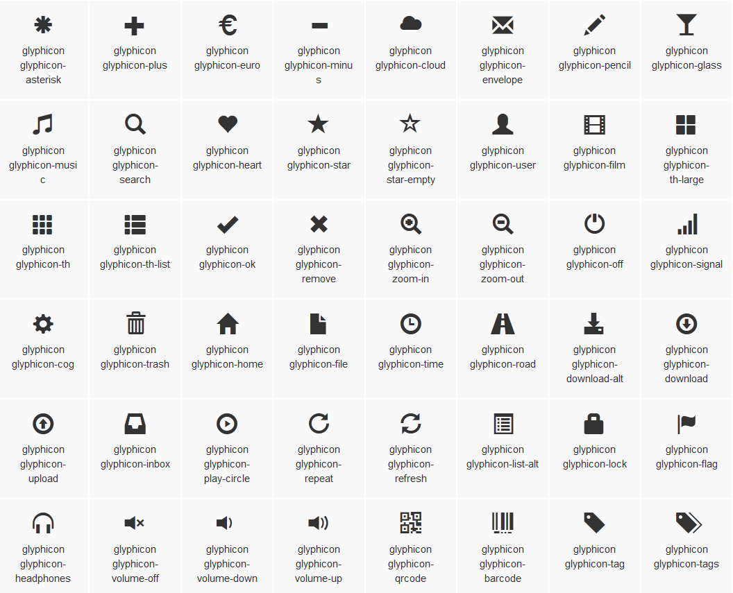
200个icon:
这里说的图标就是Web制作中常看到的小icon图标,可以说这些小icon图标是一个优秀Web中不可缺少的一部分,起到画龙点睛的效果。在Bootstrap框架中也为大家提供了近200个不同的icon图片,而这些图标都是使用CSS3的@font-face属性配合字体来实现的icon效果。
放心使用:
在具体介绍Bootstrap的icon图标之前,我们首先要感谢glyphicons.com网站,因为Bootstrap框架中图标都是glyphicons.com这个商业网站提供的,并且免费授权给Bootstrap框架使用,所以大家可以放心使用在自己的项目当中。
Bootstrap框架将内部样式也提取出来:
1、LESS版本:对应源文件为glyphicons.less文件
2、Sass版本:对应源文件为_glyphicons.scss文件
3、编译后的Bootstrap版本:查看bootstrap.css文件第2375行~第2992行
原理分析:
Bootstrap框架中的图标都是字体图标,其实现原理就是通过@font-face属性加载了字体。
/*源码请查看bootstrap.css文件第2357行~第2380行*/
@font-face {font-family: 'Glyphicons Halflings';src: url('../fonts/glyphicons-halflings-regular.eot');src: url('../fonts/glyphicons-halflings-regular.eot?#iefix') format('embedded-opentype'), url('../fonts/glyphicons-halflings-regular.woff') format('woff'), url('../fonts/glyphicons-halflings-regular.ttf') format('truetype'), url('../fonts/glyphicons-halflings-regular.svg#glyphicons_halflingsregular') format('svg');}大家或许会问,这些字体我去哪里获取。如果你是从前面一直阅读过来,我们在介绍文件结构那一节就已介绍过。在Bootstrap框架中有一个fonts的目录,这个目录中提供的字体文件就是用于制作icon的字体文件。
自定义完字体之后,需要对icon设置一个默认样式,在Bootstrap框架中是通过给元素添加“glyphicon”类名来实现,然后通过伪元素“:before”的“content”属性调取对应的icon编码:
/*源码请查看bootstrap.css文件第2381行~第2992行*/
.glyphicon {position: relative;top: 1px;display: inline-block;font-family: 'Glyphicons Halflings';font-style: normal;font-weight: normal;line-height: 1; -webkit-font-smoothing: antialiased; -moz-osx-font-smoothing: grayscale;}.glyphicon-asterisk:before {content: "\2a";}….图标(二)
在网页中使用图标也非常的简单,在任何内联元素上应用所对应的样式即可:
<span class="glyphicon glyphicon-search"></span><span class="glyphicon glyphicon-asterisk"></span><span class="glyphicon glyphicon-plus"></span><span class="glyphicon glyphicon-cloud"></span>
运行效果如下或查看右侧结果窗口:
所有icon都是以”glyphicon-”前缀的类名开始,然后后缀表示图标的名称。具体说明如下:
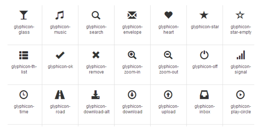
所有名称查看:
请点击:http://getbootstrap.com/components/#glyphicons 链接查阅或根据bootstrap.css文件第2393行~第2992行查阅。
特别说明:
除了使用glyphicon.com提供的图标之外,还可以使用第三方为Bootstrap框架设计的图标字体,如Font Awesome(http://www.bootcss.com/p/font-awesome/)。使用方法和上面介绍的一样,不过记得将字体下载到你本地。 感兴趣的可以阅读官网相关介绍。
- Bootstrap学习笔记(三)表单
- Bootstrap学习笔记(三)
- Bootstrap css学习笔记(三)——表单与按钮
- Bootstrap学习笔记(二) 表单
- Bootstrap—表单学习笔记
- BootStrap学习笔记三
- bootstrap学习笔记(三)
- bootstrap学习笔记(三)--form
- Bootstrap学习笔记之插件(三)
- bootstrap 学习笔记 - 3 (表格 + 表单 +控件)
- Bootstrap快速学习笔记(2)表单系列之一
- Bootstrap快速学习笔记(2)表单系列之二
- Bootstrap学习总结笔记(3)-- 基本样式之表单
- bootstrap框架学习笔记二(表单、按钮)
- bootstrap学习笔记(1)--form表单之注册
- bootstrap学习笔记-第3章 表单
- bootstrap表单学习笔记3-1
- bootstrap表单学习笔记3-2
- CoordinatorLayout的使用如此简单
- GridView绑定数据的方法
- bzoj1087: [SCOI2005]互不侵犯King
- CENTOS: Docker Pull下来的TOMCAT Image安装东西。
- 设计模式之装饰
- Bootstrap学习笔记(三)表单
- React Native 指定 style
- android截屏 (非root,只限当前acitvity当中)
- 多个线程之间如何进行通信
- FCN-for-semantic-image-segmentation 训练过程的一些坑记录_0
- 夕拾算法进阶篇:20)货币系统 (完全背包_动态规划DP)
- 多个文件打包下载 java
- 使用consul实现分布式服务注册和发现
- iOS开发小记:运用Runtime机制扩大UIButton的响应区域