Bootstrap-表格
来源:互联网 发布:阿里云备案幕布尺寸 编辑:程序博客网 时间:2024/05/19 05:03
1、Bootstrap为表格的不同样式提供了不同的类名(如<table class="table">):
.table:基础表格
.table-striped:斑马线表格
.table-bordered:带边框的表格
.table-hover:鼠标悬停高亮的表格
.table-condensed:紧凑型表格
.table-responsive:响应式表格
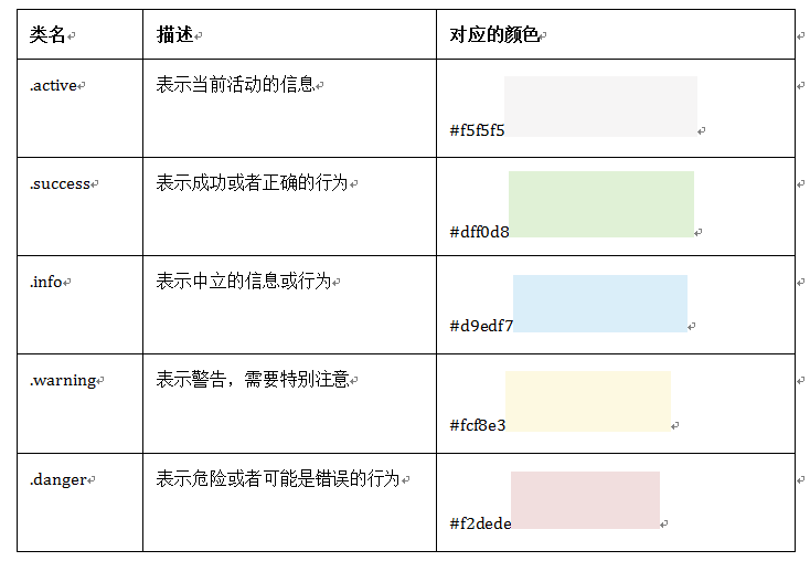
2、Bootstrap为表格的行元素<tr>提供了不同的类名,每种类名控制了行的不同颜色:
<tr>的类名样式,再加上<table class="table-hover"></table>时,会有相应的悬浮样式,所以若给tr元素添加其他颜色时,table-hover中也要相应的改变;
3、表格结构:
<table><thead><tr><th>表格标题</th>…</tr></thead><tbody><tr><td>表格单元格</td>…</tr> …</tbody></table>
4、基础表格(通过类名“.table”来控制)
.table的作用
☑ 给表格设置了margin-bottom:20px以及设置单元内距
☑ 在thead底部设置了一个2px的浅灰实线
☑ 每个单元格顶部设置了一个1px的浅灰实线
5、斑马线表格(通过类名".table-striped"):
源码:(在tbody隔行添加浅灰背景色)
.table-striped > tbody > tr:nth-child(odd) > td,.table-striped > tbody > tr:nth-child(odd) > th {background-color: #f9f9f9;}用法:
<table class="table table-striped">.......</table> /*这里基础表格让表格部分地方有边框,更好的显示*/
6、带边框表格(通过类名“.table-bordered”):
源码:(所有单元格具有一条1px的边框)
.table-bordered { border: 1px solid #ddd;/*整个表格设置边框*/}.table-bordered > thead > tr > th,.table-bordered > tbody > tr > th,.table-bordered > tfoot > tr > th,.table-bordered > thead > tr > td,.table-bordered > tbody > tr > td,.table-bordered > tfoot > tr > td {border: 1px solid #ddd; /*每个单元格设置边框*/}.table-bordered > thead > tr > th,.table-bordered > thead > tr > td {border-bottom-width: 2px;/*表头底部边框*/}用法:
<table class="table table-bordered">.......</table> /*需要加上table维持基本的样式*/
7、鼠标悬浮高亮表格(通过类名".table-hover"):
源码(添加灰色背景):
.table-hover > tbody > tr:hover > td,.table-hover > tbody > tr:hover > th {background-color: #f5f5f5;}用法:
可以和其他表格样式搭配(但是都需要".table"作为基础):
<table class="table table-striped table-hover">...</table><table class="table table-border table-hover">...</table><table class="table table-striped table-border table-hover">...</table>
8、紧凑型表格(通过类名".table-condensed")
源码(重置了单元格内padding的值,8px到5px):
.table-condensed > thead > tr > th,.table-condensed > tbody > tr > th,.table-condensed > tfoot > tr > th,.table-condensed > thead > tr > td,.table-condensed > tbody > tr > td,.table-condensed > tfoot > tr > td {padding: 5px;}用法:
可以和其他表格搭配使用,但不能缺少类名“.table”;
<table class="table condensed">...</table>
9、响应式表格(通过类名“.table-responsive”)
响应式表格效果:当浏览器可视区域小于768px时,表格底部会出现水平滚动条;当浏览器可视区域大于768时,表格底部的水平滚动条会消失且会随着浏览器可视区大小变化。
用法(注意):
<div class="table-respoonsive"> <table class="table">...</table></div>
注意:Bootstrap提供了容器,设置该容器类名“.table-responsive”,即具有响应式效果。
0 0
- Bootstrap 表格
- Bootstrap 表格
- Bootstrap 表格
- BootStrap表格
- Bootstrap 表格
- Bootstrap 表格
- Bootstrap 表格
- bootstrap表格
- Bootstrap表格
- bootstrap表格
- bootstrap表格
- Bootstrap 表格
- Bootstrap<表格>
- Bootstrap-表格
- Bootstrap 表格
- bootstrap 表格
- Bootstrap表格
- BOOTSTRAP--表格
- ReactiveCocoa 中 RACSignal 是如何发送信号的
- From表单提交刷新页面?
- log4j.xml
- [hive]动态分区和静态分区
- Linux下执行脚本提示No such file or directory
- Bootstrap-表格
- Internet通信1
- Internet通信3-Socket服务器
- 流总结
- Event Listener-2
- fragment向activity传递数据-1
- 自定义ScrollView,监听滑动回至顶…
- 截断edittext的焦点
- 从git上导出gradle项目并导入到Eclipse中