[CSS3]CSS3 Media Queries在iPhone4和iPad上的运用
来源:互联网 发布:千里眼被淘宝屏蔽 编辑:程序博客网 时间:2024/06/11 18:51
CSS3 Media Queries在iPhone4和iPad上的运用
CSS3 Media Queries的介绍在W3CPlus上的介绍已有好几篇文章了,但自己碰到的问题与解决的文章还是相对的较少。前几天在《修复iPhone上submit按钮bug》上介绍了修复form中sumit按钮的bug。同一个项目,为了实现iPhone和iPad横板与竖板的风格,让我还是头疼了一翻。
一开始按照CSS3 Media Queries模板中的介绍来运用,虽然帮我解决了iPad的横板与竖板的风格渲染问题,但在iPhone4上还是存在问题的。后来结过网上的查找,总算是问题解决了,下面就来看看问题是如何解决的。
在具体开始之前,先来看看他的源码:
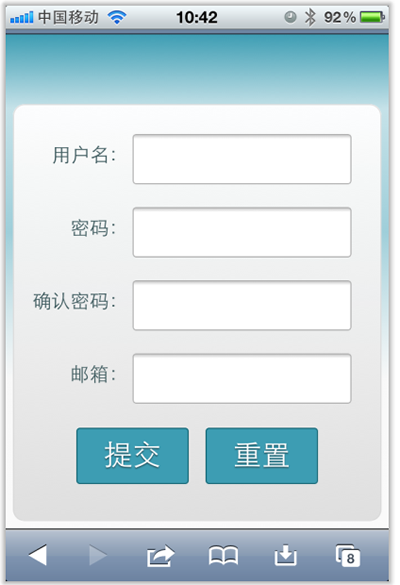
<!DOCTYPE HTML><html lang="en-US"><head><meta charset="UTF-8"><meta name="viewport" content="width=device-width, initial-scale=1, maximum-scale=1"><title>login form</title><style type="text/css" media="screen">button,input{ margin: 0; font-size: 100%; vertical-align: middle; *overflow: visible; line-height: normal;}button::-moz-focus-inner,input::-moz-focus-inner { padding: 0; border: 0;}button,input[type="button"],input[type="reset"],input[type="submit"] { cursor: pointer; -webkit-appearance: button;}body {margin: 0;padding: 58px 2% 2%; background: -webkit-gradient( linear, left top, left bottom, color-stop(0%,rgba(61,157,179,1)), color-stop(15%,rgba(61,157,179,0.3)), color-stop(40%,rgba(61,157,179,.5)), color-stop(70%,rgba(239,239,239,.4)), color-stop(100%,rgba(239,239,239,0.3)));background: -webkit-linear-gradient(top, rgba(61,157,179,1) 0%,rgba(61,157,179,0.8) 15%,rgba(61,157,179,.5) 40%,rgba(239,239,239,.4) 70%,rgba(239,239,239,0.3) 100%); background-repeat: no-repeat;background-attachment: fixed;}form {margin: 0;padding: 0;}form fieldset {border: none;border-radius: 10px;box-shadow: inset 0 0 2px rgba(0,0,0,0.3),0 0 5px rgba(0,0,0,0.13);background-color: rgba(255,255,255,0.8); background-image: -webkit-gradient(linear, 0 0, 0 100%, from(rgba(255,255,255,0.8)), to(rgba(216,216,216,0.8))); background-image: -webkit-linear-gradient(top,rgba(255,255,255,0.8), rgba(216,216,216,0.8)); background-repeat: repeat-x; padding:20px 5%; margin: 0; position: relative; border: 1px solid rgba(216,216,216,0.8);}.control-group {margin-bottom: 15px;}.control-label {color: #405c60;display:block;line-height: 18px;font-weight: normal;font-size: 16px;display:inline-block;min-width: 80px;max-width: 80px;text-align: right;margin-top: 12px;vertical-align: top;}.controls {display: inline-block;vertical-align: top;width: 65%;}input { outline: medium none;}input:not([type="checkbox"]){width: 90%;margin-top: 4px;padding: 10px;border: 1px solid rgb(178, 178, 178);-webkit-appearance: textfield;-webkit-box-sizing: content-box; box-sizing : content-box; border-radius: 3px; box-shadow: 0px 1px 4px 0px rgba(168, 168, 168, 0.6) inset;-webkit-transition: all 0.2s linear; transition: all 0.2s linear;}input:not([type="checkbox"]):active,input:not([type="checkbox"]):focus{border: 1px solid rgba(91, 90, 90, 0.7);background: rgba(238, 236, 240, 0.2); box-shadow: 0px 1px 4px 0px rgba(168, 168, 168, 0.9) inset;}.form-actions {text-align: center;} .form-actions input{width: 30%;cursor: pointer;background: rgb(61, 157, 179);padding: 8px 5px;font-family: 'BebasNeueRegular','Arial Narrow',Arial,sans-serif;color: #fff;font-size: 24px;margin: 5px;border: 1px solid rgb(28, 108, 122);margin-bottom: 10px;text-shadow: 0 1px 1px rgba(0, 0, 0, 0.5);border-radius: 3px;box-shadow:0px 1px 6px 4px rgba(0, 0, 0, 0.07) inset, 0px 0px 0px 3px rgb(254, 254, 254), 0px 5px 3px 3px rgb(210, 210, 210); -webkit-transition: all 0.2s linear; transition: all 0.2s linear; -webkit-appearance: none; }.form-actions input:hover{background: rgb(74, 179, 198);}.form-actions input:active,.form-actions input:focus{background: rgb(40, 137, 154);position: relative;top: 1px;border: 1px solid rgb(12, 76, 87); box-shadow: 0px 1px 6px 4px rgba(0, 0, 0, 0.2) inset;}</style> </head> <body> <form name="form1" method="post" action="2.html" onsubmit="return check()" class="form-horizontal"><fieldset><div class="control-group"><label for="text1" class="control-label">用户名:</label><div class="controls"><input id="username_reg" type="text" name="text1" onblur="check()" required="required" /><div class="help-inline" id="div1"></div></div></div><div class="control-group"><label for="text2" class="control-label">密码:</label><div class="controls"><input id="password_reg" type="password" name="text2" onblur="check()" required="required"><div class="help-inline" id="div2"></div></div></div><div class="control-group"><label for="text3" class="control-label">确认密码:</label><div class="controls"><input id="confirm_reg" type="password" name="text3" onblur="check()" required="required" /><div class="help-inline" id="div3"></div></div></div><div class="form-actions"><input type="button" value="提交" name="tect6" class="btn btn-primary" onclick="reg()" /><input type="reset" value="重置" name="text7" class="btn" /></div></fieldset> </form> </body></html>现在在iPhone4竖板是OK的,如下图所示
但现在需求是,在iPhone4的横板以及iPad的横板与竖板下,也需要让表单居中显示:
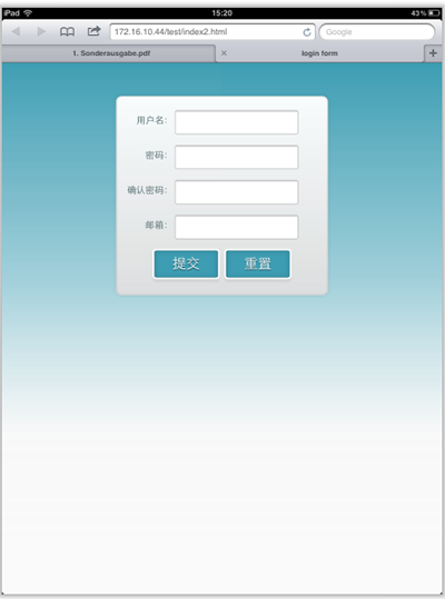
上图显示的是iPad竖板下的需求,横板下也需要类似的效果。
需求明确,做法也是有思路的,首先我按照:CSS3 Media Queries模板中的模板在样式中增加了代码:
/*iPad竖板*/@media screen and (max-device-width: 768px) and (orientation: portrait) { form { margin: 0 25%; } }/*iPad横板*/@media screen and (max-device-width: 1024px) and (orientation: landscape) { form { margin: 0 25%; } }/*iPhone4*/@media only screen and (max-device-width: 480px), only screen and (-webkit-min-device-pixel-ratio: 2) {form { margin: 0 ;} .controls { width: 68%; }}加上上面代码后在iPad下是正常了,而且不会有什么问题存在。但在iPhone4上依然存在一个怪异的现象:当你iPhone4加载页面是用横板加载,再旋转到竖板,不会存在任何问题,而且显示也是蛮正常的。但是初始加载页面是竖板,然后在旋转到横板,就有问题了,表单给放大了
初步给我感觉就是放大了,但具体是不是因为这个原因,我也不太清楚,查找了一些资料,也尝试了无解决办法。最后也从横板竖板的思路出发查找资料,经过一试,给解决了,下面来看看这段代码:
/* iPhone 4 竖板 */@mediaonly screen and (-webkit-min-device-pixel-ratio : 1.5) and (orientation:portrait),only screen and (min-device-pixel-ratio : 1.5) and (orientation:portrait){ form { margin:0; }.controls {width: 68%;}}/* iPhone 4 横板 */@mediaonly screen and (-webkit-min-device-pixel-ratio : 1.5) and (orientation:landscape),only screen and (min-device-pixel-ratio : 1.5) and (orientation:landscape){ form { margin:0 10%; }.controls {width: 68%;}}这样一来就OK了。在iPhone4和iPad的横竖板下都能正常让表单居中显示。

那么以后大家在iPhone4和iPad设备上,就可以按照横竖板来定样式了:
1、iPhone4竖板
@mediaonly screen and (-webkit-min-device-pixel-ratio : 1.5) and (orientation:portrait),only screen and (min-device-pixel-ratio : 1.5) and (orientation:portrait){/*你的样式写在这里*/}2、iPhone横板
@mediaonly screen and (-webkit-min-device-pixel-ratio : 1.5) and (orientation:landscape),only screen and (min-device-pixel-ratio : 1.5) and (orientation:landscape){/*你的样式写在这里*/}3、iPad竖板
@media screen and (max-device-width: 768px) and (orientation: portrait) {/*你的样式写在这里*/ }4、iPad横板
@media screen and (max-device-width: 1024px) and (orientation: landscape) {/*你样式写在这里*/ }上面四种CSS3 Media Queries就是用来对付iPhone4和iPad的,至于其他的运用,大家参考下面我重新整理的CSS3 Media Queries模板:
CSS3 Media Queries 模板:
1、Smartphones (竖板和横板)
@media only screen and (min-device-width : 320px) and (max-device-width : 480px) {/* 你的样式写在这里 */}//===或者====//< link rel="stylesheet" href="smartphones.css" media="only screen and (min-device-width : 320px) and (max-device-width : 480px)" />2、Smartphones (横板)
@media only screen and (min-width : 321px) {/* 你的样式写在这里 */}//===或者====//< link rel="stylesheet" href="smartphones-landscape.css" media="only screen and (min-width : 321px)" />3、Smartphones (竖板)
@media only screen and (max-width : 320px) {/* 你的样式写在这里 */}//===或者====//< link rel="stylesheet" href="smartphones-portrait.css" media="only screen and (max-width : 320px)" />4、iPad(竖板和横板)
@media only screen and (min-device-width : 768px) and (max-device-width : 1024px) {/* 你的样式写在这里 */}//===或者====//< link rel="stylesheet" href="ipad.css" media="only screen and (min-device-width : 768px) and (max-device-width : 1024px)" />5、iPad横板
@media only screen and (min-device-width : 768px) and (max-device-width : 1024px)and (orientation : landscape) {/* 你的样式写在这里 */}//===或者====//< link rel="stylesheet" href="ipad-landscape.css" media="only screen and (min-device-width : 768px) and (max-device-width : 1024px)and (orientation : landscape)" />6、iPad的竖板
@media only screen and (min-device-width : 768px) and (max-device-width : 1024px) and (orientation : portrait) {/* 你的样式写在这里 */}//===或者====//< link rel="stylesheet" href="ipad-portrait.css" media="only screen and (min-device-width : 768px) and (max-device-width : 1024px) and (orientation : portrait)" />7、Desktops and laptops
@media only screen and (min-width : 1224px) {/* 你的样式写在这里 */}//===或者====//< link rel="stylesheet" href="desktops-and-laptops.css" media="only screen and (min-width : 1224px)" />8、Large screens
@media only screen and (min-width : 1824px) {/* 你的样式写在这里 */}//===或者====//< link rel="stylesheet" href="large-screens.css" media="only screen and (min-width : 1824px)" />9、iPone4
@media only screen and (-webkit-min-device-pixel-ratio : 1.5),only screen and (min-device-pixel-ratio : 1.5) {/* 你的样式写在这里 */}//===或者====//< link rel="stylesheet" href="iphone4.css" media="only screen and (-webkit-min-device-pixel-ratio : 1.5),only screen and (min-device-pixel-ratio : 1.5)" />10、iPhone4竖板
@media only screen and (-webkit-min-device-pixel-ratio : 1.5) and (orientation:portrait),only screen and (min-device-pixel-ratio : 1.5) and (orientation:portrait){/*你的样式写在这里*/}//===或者====//< link rel="stylesheet" href="iphone4-portrait.css" media="only screen and (-webkit-min-device-pixel-ratio : 1.5) and (orientation:portrait),only screen and (min-device-pixel-ratio : 1.5) and (orientation:portrait)" />11、iPhone4横板
@media only screen and (-webkit-min-device-pixel-ratio : 1.5) and (orientation:landscape),only screen and (min-device-pixel-ratio : 1.5) and (orientation:landscape){/*你的样式写在这里*/}//===或者====//< link rel="stylesheet" href="iphone4-landscape.css" media="only screen and (-webkit-min-device-pixel-ratio : 1.5) and (orientation:landscape),only screen and (min-device-pixel-ratio : 1.5) and (orientation:landscape)" />上面罗列了常用的CSS3 Media Queries模板,特别是在移动设备上的几种,希望对大家在今后的移动开发端上的运用有所帮助。当然CSS3 Media Queries的运用条件往往不只这些,大家完全可以根据自己的需求去定义不同的条件,但个人建议,使用CSS3 Media Queries采用主流就Ok了。随着潮流走嘛。那么今天就扯到这了。如果大家有更好的经验,可以通过下面的评论与我们一起分享。
转载自:W3CPLUS
- CSS3 Media Queries在iPhone4和iPad上的运用
- CSS3 Media Queries在iPhone4和iPad上的运用
- [CSS3]CSS3 Media Queries在iPhone4和iPad上的运用
- css3 @media ipad/iphone4/iphone5/ipad mini/ipad Retina
- iPhone,iPad 等常用设备的 CSS3 Media Queries
- CSS3 Media Queries
- CSS3 media queries
- CSS3 Media Queries模板
- Hardboiled CSS3 Media Queries
- CSS3 Media Queries模板
- CSS3 Media Queries 简介
- CSS3 Media Queries
- CSS3 Media Queries
- CSS3 Media Queries
- CSS3 Media Queries
- CSS3 Media Queries 片段
- CSS3 Media Queries 简介
- CSS3 Media Queries
- Spring AOP控制日志管理对修改字段比较提取插入
- SSRS2008-Reporting Service Tips
- msysgit - Windows Git安装配置
- google code上建立项目的方法
- 自绘文本、颜色的CStatic
- [CSS3]CSS3 Media Queries在iPhone4和iPad上的运用
- linux几种快速清空文件内容的方法
- cocos2d的基础
- 如何编程实现开启或关闭GPS?
- Page眼中的Google+:Google的社交支柱
- 全球首款22nm CPU性能评测
- Android特色开发 Google Map
- VC++常规错误之15:switch中初始化的错误.error C2361: “default”标签跳过“acmd”的初始化操作
- ETL工具比较